Tab+Product
모듈 구성
참고 링크
Astro
---import Title from "@shared/ui/title/Title.astro";import Tab from "@shared/module/tab/Tab.astro";import Carousel from "@shared/module/carousel/Carousel.astro";import ProductUnit from "@shared/module/product-unit/ProductUnit.astro";import TextButton from "@shared/ui/button/TextButton.astro";
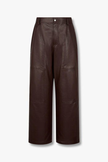
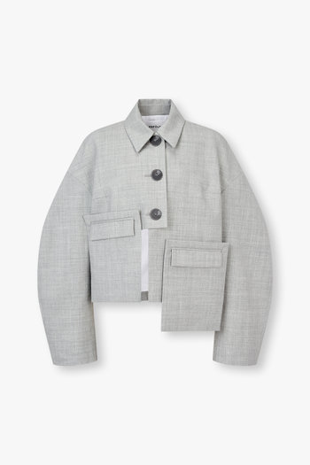
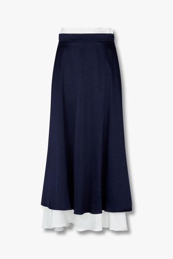
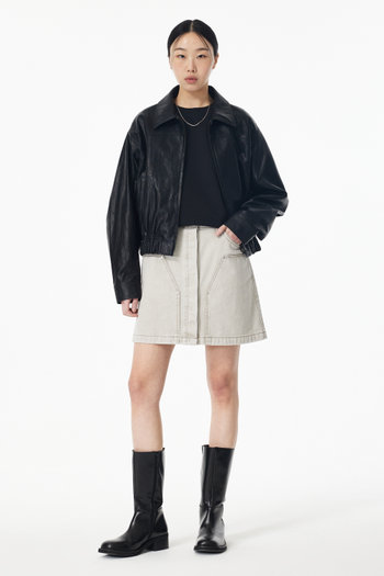
const tabs = [  { label: "ALL", key: "000" },  /* ...*/];const products = [  {    link: "#",    brand: "STUDIO TOMBOY",    name: "레더 블루종 자켓",    price: "299,000",    media: {      src: "/dummy/images/s3/goods/org/328/250225061574328.jpg?RS=350&SP=1",      alt: "",      width: 375,      height: 562,    },  },  /* ...*/];---
<section class="v-tmpl v-tmpl--tab-product" style="margin-bottom: 0px;">  <Title level={2}>TITLE</Title>
  <!-- Tab 문서 참고 -->  <Tab ... />
  <!-- tab-container 문서 참고 -->  {tabs.map((tab, i) => (    <div class="v-tab-panel" ...>      <Carousel slidesPerView={1}>
        <!-- 탭 인덱스별 내용이 달라보이도록 products를 섞는 함수 -->        {shiftItems(products, i).map((item) => (          <swiper-slide>            <ProductUnit {...item} />          </swiper-slide>        ))}      </Carousel>
      <div class="v-button-wrap">        <TextButton style="outlined full">더 많은 상품 보기</TextButton>      </div>    </div>  ))}</section>
HTML
준비 중입니다.